 English
 Spanish
 French
 German
 Italian
 Russian
Fixed 3 Columns
.grid-cols-3
Responsive Columns
.grid-cols-2 sm:grid-cols-3 lg:grid-cols-4
Column Span Example
Grid with .col-span-2
Auto-fit Columns
auto-fit + minmax(120px, 1fr)
Grid with Profile Cards
Linda
HR Manager
James
Engineer
Feature Comparison
Responsive Grid (1 → 2)
.grid-cols-1 sm:grid-cols-2
1. Two-Column Feature Block
A standard two-column layout for features, services, or article excerpts, stacking vertically on smaller screens.
Growth Analytics
Gain deep insights into your business performance with our advanced analytics tools.
Secure Platform
Your data is protected with industry-leading security protocols and encryption.
Uses **`grid grid-cols-1 md:grid-cols-2`** to switch from single to two columns.
2. Uneven Column Layout (Sidebar/Content)
A common layout for dashboards or content pages, featuring a narrower sidebar and a wider main content area that stack on mobile.
Filters
Main Content Area
This wider section holds primary information, such as product listings, articles, or data tables. It occupies two-thirds of the available space on large screens.
Uses **`grid grid-cols-1 lg:grid-cols-3`** with **`lg:col-span-1`** and **`lg:col-span-2`** for responsive column spans.
3. Responsive Card Grid (2-3-4 Columns)
A dynamic grid of cards that adjusts the number of columns based on screen size, perfect for e-commerce products or portfolios.
Utilizes **`grid-cols-2 md:grid-cols-3 lg:grid-cols-4`** for adaptive column counts, plus `hidden` utilities for specific card visibility.
4. Form Layout with Responsive Columns
A multi-column form that gracefully switches to a single column on smaller devices, improving usability.
Uses **`grid grid-cols-1 sm:grid-cols-2`** for responsiveness and **`sm:col-span-2`** for full-width elements on small screens.
5. Pricing Table with Highlighted Column
A pricing table where a featured plan column stands out, and all plans stack on mobile.
Basic
$9/mo
- 5 Projects
- 1 GB Storage
Pro
$29/mo
- Unlimited Projects
- 100 GB Storage
- Premium Support
Enterprise
$99/mo
- Custom Projects
- Unlimited Storage
Uses **`grid-cols-1 md:grid-cols-3`** and a custom **`md:scale-100`** to revert transform on medium screens, ensuring the "Pro" column stands out on mobile too.
6. Article Content with Image & Text Columns
A layout for articles or blog posts where an image sits beside text on larger screens and above on smaller ones.
The Future of AI in Design
Artificial intelligence is rapidly transforming the design landscape, offering new tools and possibilities for creatives. From automated mockups to personalized user experiences, AI's influence is growing.
Read Full ArticleUtilizes **`grid-cols-1 md:grid-cols-5`** with **`md:col-span-2`** and **`md:col-span-3`** for a responsive image-text split.
Premium Wireless Headphones
Noise cancelling with 30hr battery life
Pro Fitness Smartwatch
Heart rate monitor & GPS tracking

Top Frontend Frameworks in 2023
Explore the most popular JavaScript frameworks and their use cases in modern web development...
 Sarah Johnson
Machine Learning for Beginners
A comprehensive guide to getting started with machine learning algorithms and their practical applications...
 Dr. Michael Chen
Modern Villa with Ocean View
$1,250,000123 Coastal Drive, Malibu, CA
 Lisa Ray
Luxury Downtown Apartment
456 Urban Ave, New York, NY

Dr. Emily Rodriguez
Lead Data Scientist
PhD in Machine Learning with 10+ years experience in AI research and implementation.

Marcus Johnson
Creative Director
Award-winning designer with expertise in branding, UI/UX, and interactive media.
Gourmet Avocado Toast
Creamy avocado on sourdough with cherry tomatoes, feta, and a drizzle of balsamic glaze.
Ingredients
- 2 slices sourdough bread
- 1 ripe avocado
- 1/4 cup cherry tomatoes
 Chef Maria
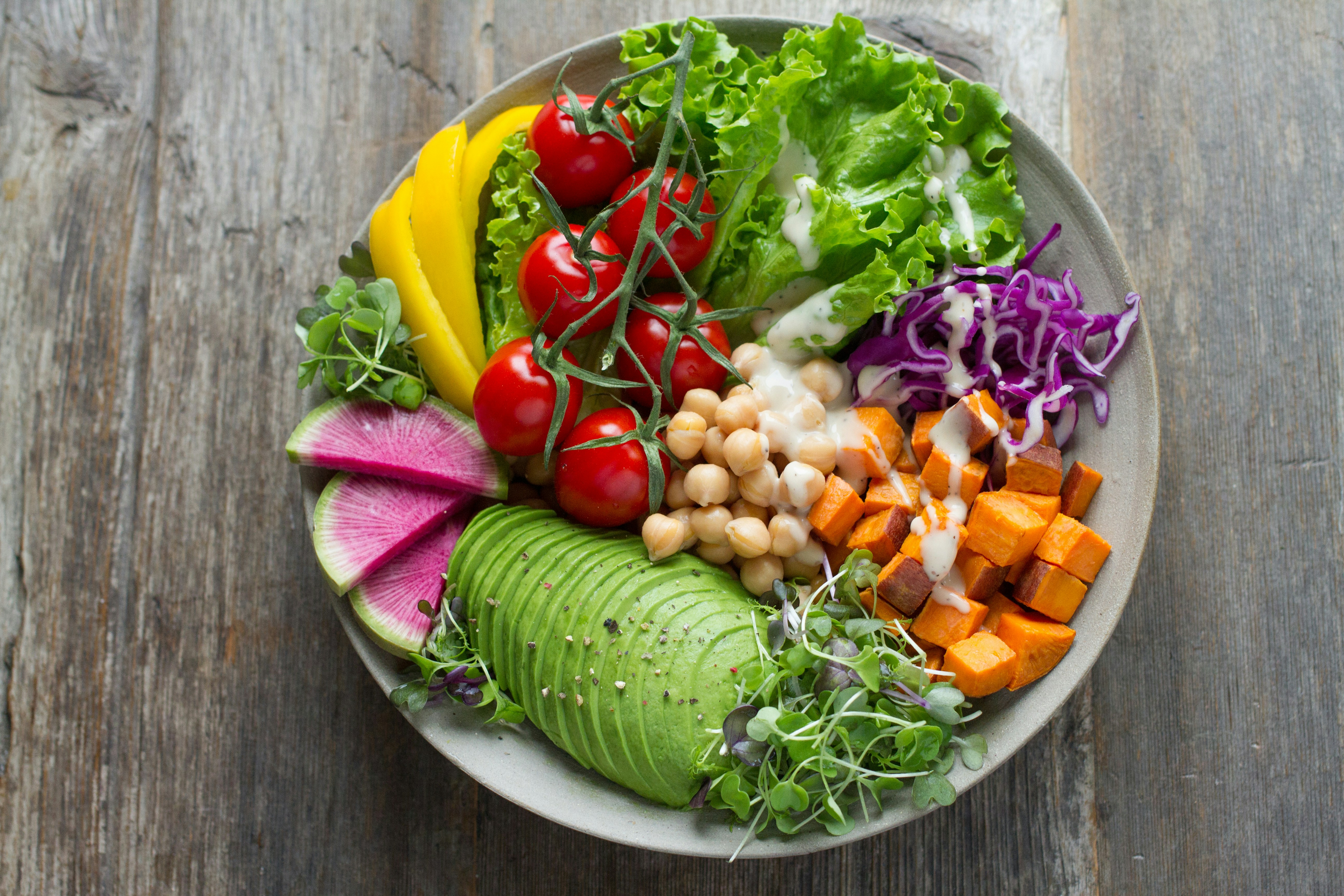
Rainbow Power Salad
Packed with nutrients, this colorful salad features quinoa, roasted veggies, and tahini dressing.
Nutrition
 Chef Antoine